ISO/IEC JTC 1/SC34 N0xxx
ISO/IEC JTC
1/SC34/WG2 N390
ISO/IEC JTC 1/SC34/WG2
Information Technology --
Document Description and Processing
Languages
-- Information Presentation
| TITLE: | Status report of Japanese activity on the extension to font reference |
| SOURCE: | Toshiya Suzuki/Hiroshima University |
| PROJECT: | |
| PROJECT EDITOR: | |
| STATUS: | Informal Liaison |
| ACTION: | For information |
| DATE: | 2010-09-01 |
| DISTRIBUTION: | SC34, SC34/WG2 and Liaisons |
| REFER TO: | |
| REPLY TO: |
Status report of Japanese activity on the extension to font reference
Reporting period: 24 March, 2010 - 1 September, 2010
As reported in SC34/WG2 N377, Japanese experts in SC34/WG2 are working to draft the font reference method to improve the font reference based on the familyname matching.
To define the quantitive properties to refer the typeface, we investigated the conventional terms used in typographic designers, like "imaginary body" (���z�{�f�B), "counter" (�ӂƂ���), "the center of gravity" (�d�S) etc. As a result of investigation, these terms are often used by subjective context, and it is difficult to share the evaluations in international context. For example, the question for a given CJK glyph "the counter of this glyph is wide or narrow?", it may differ among CJK people. As a result, we decided to define several self-standing properties with the name which do not conflict with conventional terms.
To measure the properties, we are working to choose the appropriate glyphs. As Latin font does not define CapHeight for all capitalized characters, it is expected that there is a consistency of the typographic design tendency in a small glyph set for daily use.
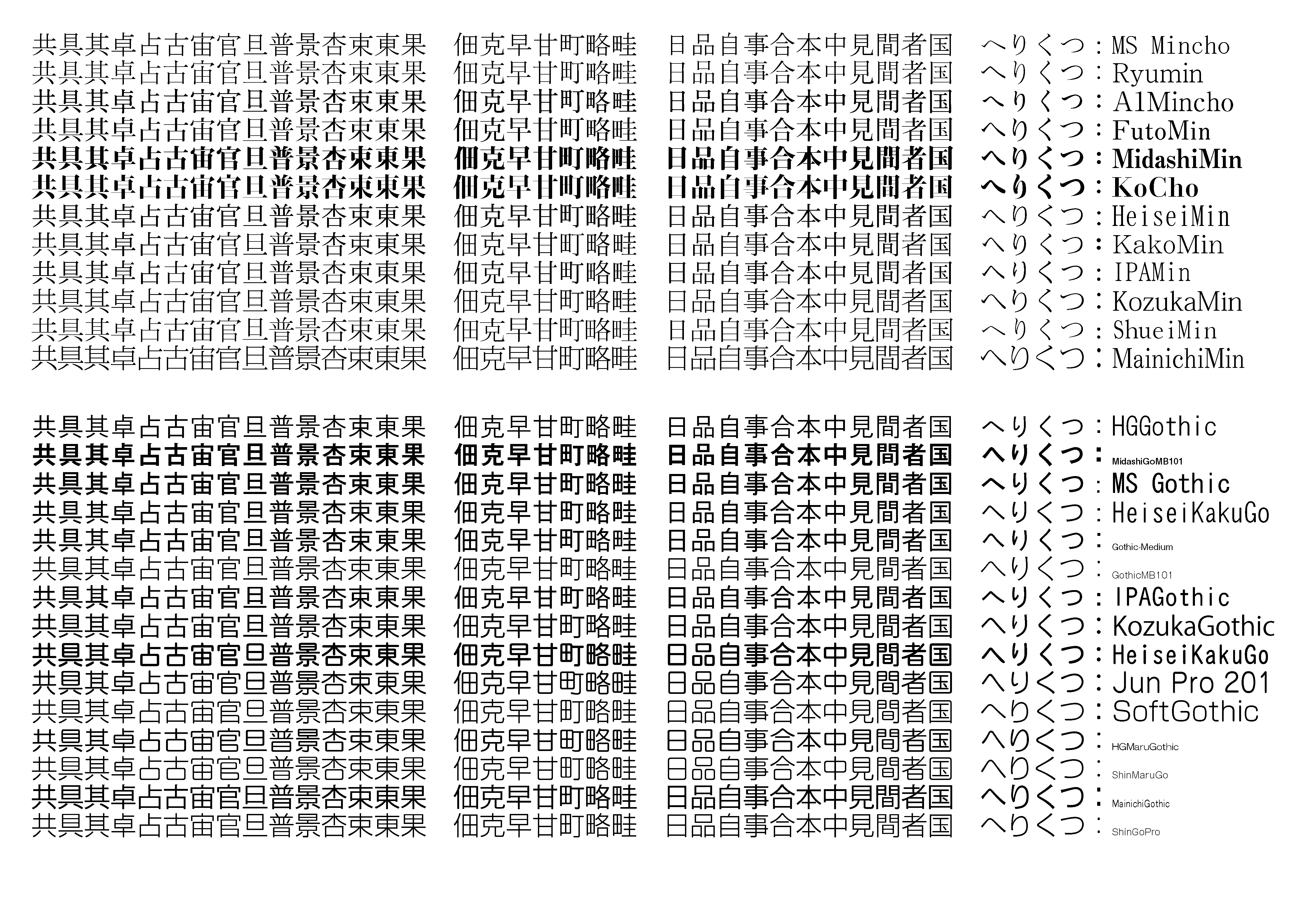 Japanese Serif and Sans-Serif typeface ordered by the width
between 2 vertical strokes in "��". Most glyph shows consistent
increasing of the widths, but not always. See the widths of
the "�c" in "��".
Japanese Serif and Sans-Serif typeface ordered by the width
between 2 vertical strokes in "��". Most glyph shows consistent
increasing of the widths, but not always. See the widths of
the "�c" in "��".
Some experts advised that the typographic design for Japanese script after JIS X 0208:1990, the similarity with the referencial typeface HeiseiMincho (��������) is very strong, especially for JoyoKanji (��p����) character set. We should consider the possibility to use rarely-used character to evaluate the typeface designers choice.
END